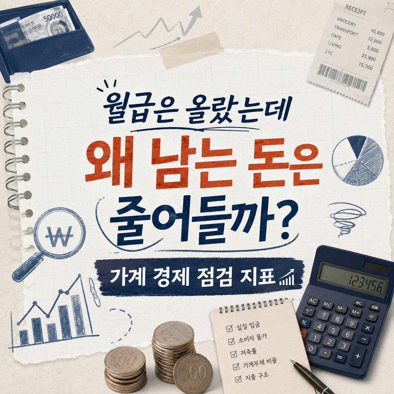
Real spending power depends on income, prices, and debt moving together, not the paycheck number alone — 8 official Korean indicators.
If your paycheck line keeps rising but there's somehow nothing extra at the end of the month, that can be a sign that prices, debt, and fixed costs are moving at a different pace than income. It's rarely down to one single cause, though — inflation, interest rates, household debt, and spending mix usually act together.
How this list is organized
- Income (#1–3) leads into spending and debt (#4–7), then an overall surplus measure (#8).
- Only official statistics that Korea's central bank and statistics agency actually publish are included, not headline numbers.
- Each entry explains reading the month-over-month and year-over-year change together, and checking seasonal adjustment and preliminary status.
Instead of headline numbers, Golladream lays out the sequence for checking your own household finances against these official statistics. These figures shift with every release and this guide reflects channels checked as of September 2026 — any borrowing or investment decision is entirely your own responsibility, and this list exists to point you toward the disclosures and official statistics behind it.
Nominal Wage
Real Wage
Household Disposable Income
Household Trend Survey — Consumption Expenditure
Household Credit
Survey of Household Finances and Living Conditions
Debt-Service Burden
Household Surplus Ratio
Following the order narrows down the cause
Start with #1 nominal wage and #2 real wage to see whether your income growth translated into actual purchasing power, then check #4 the Household Trend Survey to compare your fixed-cost share against the national average. If you're carrying debt, #7 the debt-service burden is more useful than #5 household credit for judging your own situation, and finishing with #8 the household surplus ratio, averaged over several months, narrows the cause down further.
For any of these, checking the average alongside the median, and the month-over-month change alongside the year-over-year change, cuts down on optical illusions. These statistics get revised with each release, so make any real decision only after re-checking the latest figures on each agency's official page.
Frequently asked questions
My nominal wage went up, so why does it feel like I have less breathing room?
If nominal wage growth runs below inflation, real wages can actually fall even as the paycheck number rises. Comparing the official real-wage figures against consumer price data shows whether your income growth translated into more actual purchasing power — and the gap is usually the product of several factors together, from prices to interest rates to how a household's spending is composed.
News keeps mentioning rising household debt — how does that connect to my own situation?
A rising household credit balance on its own isn't the same as your personal repayment risk. It's more useful to compare your own debt-service burden and DSR ratio, and how your monthly payment shifts with interest rate changes, against the average and median figures in the official Survey of Household Finances and Living Conditions.
Which indicator should I check first when reviewing my household finances?
A reasonable order is to start with nominal and real wages to see your actual purchasing power, then compare your fixed-cost share against the national average using the Household Trend Survey's spending data, and finish with the debt-service burden and household surplus ratio to gauge what's actually left over. Since these statistics get revised, check each agency's official page for the latest figures.
Where can I actually check these indicators myself?
Nominal and real wages come from the labor ministry's Survey of Labor Conditions by Employment Type; the Household Trend Survey and household credit figures are on the statistics agency's and central bank's official statistics pages. The Survey of Household Finances and Living Conditions is jointly published by the statistics agency, central bank, and financial regulator, and each agency's press release includes downloadable tables and raw data.
The numbers look fine, so why doesn't it feel that way?
A national average combines households across very different income levels and family sizes, so it can diverge from how any one household actually feels. Looking at the median alongside the average, broken down by income bracket, and comparing your own fixed-cost share and debt structure individually gets you closer to a judgment that matches your real situation.
Get new lists before anyone else
Once a week — only the new lists worth your time.
No spam · unsubscribe in one click
You may also like

The Won-Dollar Rate Moved Again Today — And It's Never Just One Reason: 8 Official Indicators for Understanding Why
The won-dollar exchange rate moves on interest rates, trade, and global risk appetite acting together, not any single cause — these 8 official indicators break down the pieces.

The News Says the Economy Is Improving — So Why Doesn't It Feel That Way? 8 Official Indicators for Reading the Real Trend
Production, spending, employment, and sentiment move at different speeds — that's why the economy feels different from the headlines than these 8 official indicators show.