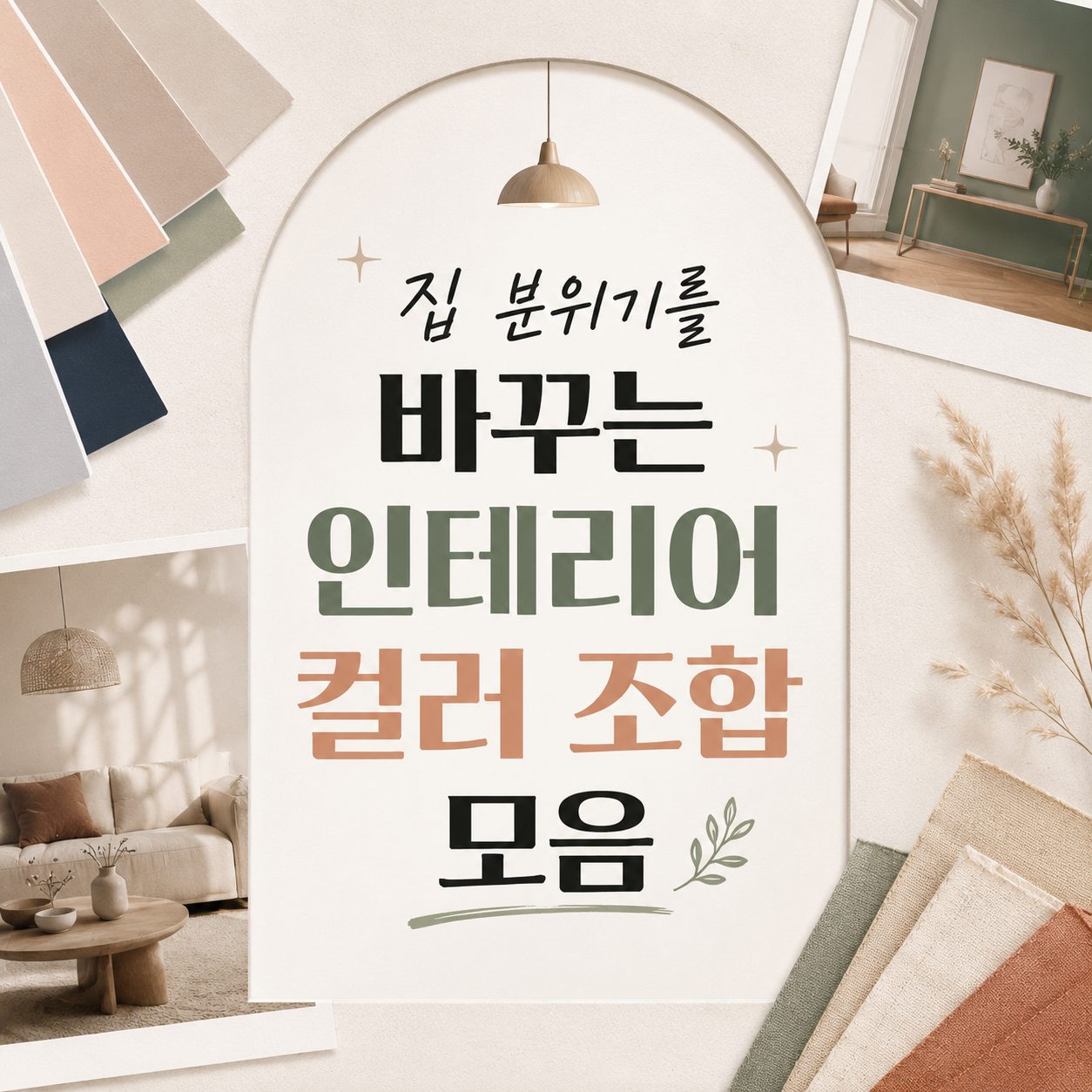
Instead of chasing one pretty color, splitting a room's palette into a base, a secondary tone, and an accent is the more reliable way to change how a space feels.
Even with the same furniture, a room's mood shifts completely once the cushions, rug, curtains, lighting, and walls change color. Rather than hunting for one perfect shade, it helps to first decide the ratio between a base color, a secondary color, and an accent.
The palettes below range from calm to lively and work across different rooms, from a studio to a bedroom to a home office. Most can start with fabric and small decor rather than any renovation, which makes them approachable even for someone new to decorating.
White & Wood Natural
Greige & Black Modern
Sage Green & Ivory
Navy & Walnut Classic
Butter Yellow & Cream
Terracotta & Beige
Light Gray & Pastel Blue
Pink, Beige & Brown
White & Cobalt Blue Accent
Olive, Khaki & Cream
Frequently asked questions
Is there a standard ratio for mixing interior colors?
A 70:20:10 split between base, secondary, and accent colors tends to work well — it keeps a room from feeling overdone while still giving it a clear direction. Leading with the accent color too heavily tends to feel tiring quickly.
How can I try a new palette without renovating?
Start with fabric and small items that are easy to swap, like cushion covers, bedding, a rug, curtains, or a lamp shade. If it works, you can expand to walls or larger furniture later.
What's a safe palette for a small space?
Lighter palettes, like white or ivory paired with light wood, tend to make a small room feel bigger. Darker colors are safer used sparingly through small decor pieces rather than across an entire wall.
Get new lists before anyone else
Once a week — only the new lists worth your time.
No spam · unsubscribe in one click